-------------------------------------
Jun 28 / Milan Fashion Campus

Color Analysis for Beginners: Find Your Best Colors

Discover your personal color palette with a color analysis online course. Learn undertones, contrast, and wardrobe tips—start dressing smarter.

Key Takeaways

Color analysis helps beginners spot a personal color palette that makes skin look clearer, eyes look brighter, and overall features look more balanced.

A good color analysis online course should teach the basics you can actually apply in your closet and shopping cart:

  • How to identify undertones (whether your skin reads more warm, cool, or neutral)

  • How contrast works (low vs high contrast between hair, skin, and eyes)

  • How seasonal systems group colors into usable palettes, then map them to outfits and makeup

Your best colors are a guide for smarter styling and fewer wrong purchases, not strict rules you must follow. If you do one thing, use your palette to choose your “near-the-face” items first (tops, scarves, jackets, glasses) since that is where color makes the most visible difference.https://academy.milanfashioncampus.eu/blog/color-analysis-online-course-personal-color-palette

You wear one color and look fresh, then another and look tired

You put on a crisp white tee and your face looks awake. Then you swap to a warm beige top and suddenly you notice under-eye shadows, redness, or a gray cast. In a 60-second mirror test, the right shade can make skin look brighter and shadows look softer.

Here’s why: color analysis is the practice of matching clothing (and hair, makeup, and accessories) to your natural coloring so your features look clear first, not the garment. When a color is “off,” it can reflect unwanted tones back onto your face, so you read it as tired even if you slept 8 hours.

If you do one thing, do this quick check in daylight near a window and with a bare face or minimal makeup:

  • Hold two tops or scarves under your chin: one cool (blue-based) and one warm (yellow-based)

  • Look for what changes first: your skin, not the color itself

  • Notice if your eyes look sharper and your jawline looks more defined, or if everything looks flatter

  • Repeat with light vs deep (pastel vs navy) to see if you need contrast or softness

A common mistake is judging the color from across the room or with overhead bathroom lighting. The fix is to get close to the mirror, keep the fabric right under your chin, and take a quick photo in the same spot so you can compare “before/after” without guessing.

By the end, you’ll know how color analysis works at a beginner level and how to start building your personal color palette from repeatable tests, not opinions.

Understand what color analysis really is and what it is not

Next, it helps to separate the clothes from the color. Color harmony is simply how well a color matches your natural coloring (your skin, hair, and eyes) so your face looks clearer and more even, not washed out or harsh.

Most of the time, the garment is not “bad” and you are not “hard to dress.” The mismatch is usually tone (how warm or cool a color reads) or intensity (how bright or muted it is). For example, two sweaters can both be “blue,” but a cool, bright cobalt can make one person look crisp while a soft, dusty blue makes them look tired, or the other way around.

Also, the biggest misconception is that a palette is a box. A personal palette is a decision filter that makes daily choices faster, not a set of rules that kills creativity.

A palette works best when you treat it like guardrails: you can still wear any style, pattern, or trend, but you choose versions that match your tone and intensity. If you do one thing, do this: when a color feels “off,” test a nearby shade by changing just one variable at a time (warmer vs cooler, or brighter vs softer) before you blame the item.

Learn the beginner color signals that determine your personal color palette

Next, focus on four simple signals that show up fast in the mirror and in photos: warm vs cool, light vs deep, bright vs soft, and overall contrast. You do not need to name a “season” yet. You just need to spot what your face reacts to when the color is close to it.

If you do one thing, do this: test colors in natural daylight near a window (not direct sun), with a clean face or light base makeup, hair pulled back, and a neutral top. Take 2–3 quick photos at the same distance so you can compare later, because the camera often shows details your eye ignores in real time.

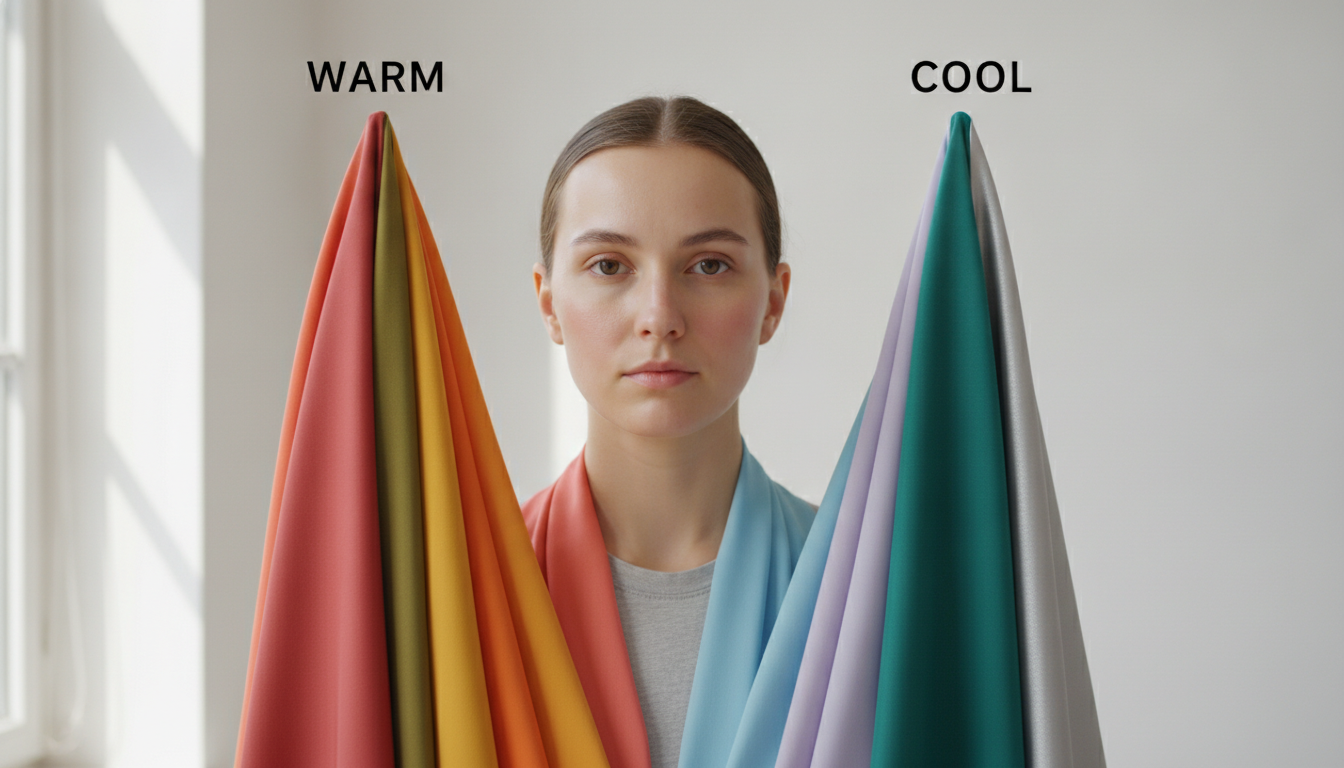
Signal 1: Warm vs cool (temperature)

Also, look for temperature first because it is the easiest to see. Warm colors have more yellow, golden, or peach in them. Cool colors have more blue, pink, or violet.

What you’ll see:

  • If warm is right, your skin can look more even and “rested,” with less grayness around the mouth and under-eyes

  • If warm is wrong, you may notice a yellow cast, blotchiness, or your redness looks sharper

  • If cool is right, your whites of the eyes can look clearer and your face looks more defined without extra shadow

  • If cool is wrong, your skin can look a bit ashy or drained in photos

Common mistake: judging by jewelry alone. Fix it by comparing two similar depths (for example, a warm beige vs a cool gray) held under your chin for 10 seconds each.

Signal 2: Light vs deep (value)

Next, check value, meaning how light or dark a color is. A light palette pushes you toward pastels, light neutrals, and lighter versions of colors. A deep palette holds up to darker shades like espresso, navy, forest, or deep berry.

What you’ll see:

  • If light is right, your face stays open and smooth, and shadows under the eyes look softer in a selfie

  • If light is wrong (too light), your features can disappear and your skin may look washed out

  • If deep is right, your face keeps its shape and your eyes and brows look clearer next to the color

  • If deep is wrong (too dark), you may see heavy shadow under the chin and around the nose

Constraint: if you are short on time, skip testing 20 colors. Test only white vs cream and light gray vs charcoal. Those four usually reveal value fast.

Signal 3: Bright vs soft (chroma)

That said, brightness (also called chroma, meaning intensity) is where many beginners get stuck. Bright colors look clear and saturated. Soft colors look muted, dusty, or slightly grayed.

What you’ll see:

  • If bright is right, your skin looks clearer and your face seems sharper in photos, not “overpowered”

  • If bright is wrong, you may notice color showing up before you do, and your skin texture can look more obvious

  • If soft is right, your skin looks calm and blended, and the color feels like it belongs to you

  • If soft is wrong, your face can look dull or tired, especially in indoor lighting

Tradeoff: bright often works best when your features already read as clear on camera, but it can fail when the color is so intense it makes every shadow look deeper. Soft can be easier day-to-day, but it can fail when it makes you look flat in photos.

Signal 4: Your overall contrast level

In practice, contrast is the difference between your lightest and darkest features (skin, hair, brows, eyes), and it affects how bold your color combinations should be. Think of it as how much “distance” there is between light and dark on your face.

What you’ll see:

  • Lower contrast often looks better in softer pairings (for example, medium denim with a muted top) than in stark black and white

  • Higher contrast often holds up to stronger pairings (for example, navy with white, or a deep jacket with a lighter top) without your face looking muted

Quick mirror check (2 minutes): step back from the mirror and squint.

  • If your features blend together, you likely read as lower contrast

  • If your features still look clearly separated, you likely read as higher contrast

Common mistake: confusing contrast with “can I wear black.” Fix it by checking black next to your face in daylight. If black creates harsh shadow under the eyes and around the mouth, try charcoal or deep navy instead.

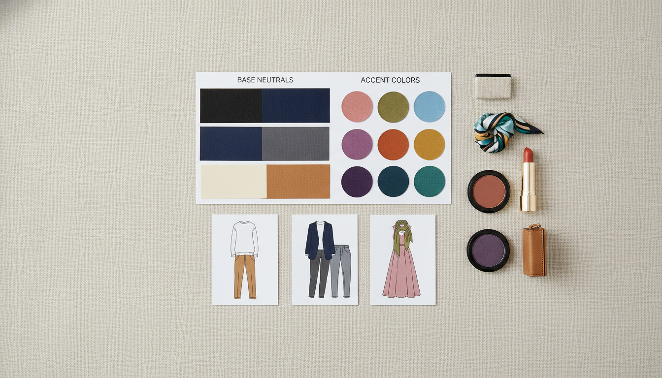
Turn your palette into a smarter wardrobe and fewer wasted purchases

Next, use your palette like a filter before you buy anything. A quick test: if a top looks great in the fitting room but sits unworn after 30 days, the color is often the issue, not your body or your style.

Start with a 30–45 minute closet edit using three piles: always works, sometimes, never. If you’re short on time, do just 20 hangers at a time and repeat over a week.

  • Always works: the pieces you reach for on busy mornings and still like in photos

  • Sometimes: works with the right makeup, lighting, or one specific pairing

  • Never: you avoid it, it makes your skin look dull, or you need “fixes” like heavy bronzer

So build your core palette from what lands in “always works”: 2–3 neutrals you can wear head-to-toe (for example: navy, cream, charcoal) plus 1–2 lighter neutrals for tops near your face. Then choose 6–10 accent colors for tops, scarves, bags, and statement pieces.

Here’s the catch: accents are where most impulse buys happen, so keep them consistent.

  • If you do one thing, do this: pick one accent family (for example: teal range or warm reds) and repeat it across seasons

  • Tradeoff: a bigger accent range is fun, but it fails when you can’t match shoes, bags, and lip colors to more than 2 outfits

  • Common mistake: buying “a pretty color” that matches nothing you own

    • Fix: before checkout, name 3 items in your closet it pairs with

In practice, use an outfit formula so getting dressed takes 5 minutes, not 25.

  • 70/20/10 formula: 70% neutrals (base), 20% secondary neutral (layer), 10% accent (scarf, shoe, bag, lipstick)

  • Near-the-face rule: keep tops, collars, and hijabs within your best colors; push “iffy” colors to pants, skirts, or handbags

  • Makeup-accessory harmony: match your lip and metal tone to your accents (for example: cool pink lip with blue-based accents; warm coral lip with warm accents)

Before/after to watch for: when the color is right, you’ll need less concealer and less “fixing” with makeup, and your outfit will look intentional even in a quick mirror check.https://academy.milanfashioncampus.eu/blog/color-analysis-online-course-personal-color-palette

Choose a color analysis online course that teaches results, not rules

So before you enroll, look for teaching that helps you see the difference on real people, not just memorize season labels.

The goal is simple: you should finish the course able to test colors in normal outfits, explain why one shade works better than another, and shop with fewer “maybe” purchases.

A quick checklist before you pay

A good beginner course usually includes:

  • Clear explanations that connect undertone, value, chroma, and contrast to what you see in the mirror

  • Strong visuals (side-by-side comparisons) showing “before/after” results on different skin tones

  • Step-by-step exercises you can do in 10 to 20 minutes with items you already own

  • Real wardrobe practice, like building 5 outfits from 10 pieces and checking which colors repeat

  • Lighting guidance, such as testing by a window in daylight and then rechecking in indoor light

Watch-outs that lead to wrong conclusions

Next, be cautious of courses that push shortcuts that only work in perfect conditions.

Common issues to avoid:

  • Relying only on vein tests, since veins can look blue, green, or purple for reasons unrelated to undertone

  • Artificial lighting demos only, because warm bulbs can make cool shades look “off” and hide redness or shadows

  • Trend-first palettes that start with what’s popular this year instead of what suits your features

  • One-size-fits-all seasons that treat everyone as a clean match, when many people need a blended or adjusted palette

If you do one thing, choose a course that gives you repeatable tests and feedback points, like comparing two similar whites (soft white vs bright white) or two lip colors, then writing down what changed in your face in under 60 seconds.

Closing remarks

So before you buy another “safe” neutral or copy a trend color, pause and remember: “Color is not just decoration. It is communication.” The shades you repeat become part of what people expect from you, and they also shape how you show up in meetings, photos, and everyday moments.

If you do one thing this week, pick three colors that make you feel instantly more confident and wear them on purpose. Ask yourself:

  • Which 3 colors make you stand taller the moment you put them on

  • Where could you wear each one in the next 7 days, like a top, scarf, lipstick, tie, or knit

  • What would change if you wore those three colors weekly, like fewer “nothing to wear” mornings or more compliments that feel specific

Here’s the catch: confidence colors only work if you actually repeat them. Start small, track how you look in natural light, and notice what happens when your color choices match the message you want to send.

Explore color and styling courses at Milan Fashion Campus

Also, if you want guided practice instead of guessing, Milan Fashion Campus offers both online learning and in-person options in Milan, depending on how you learn best.

If you’re short on time, start with the online catalog so you can study at your own pace and fit lessons around work, family, or school. Browse online fashion learning here: https://academy.milanfashioncampus.eu/

But if you want a Milan-based experience, check the on-site styling options and short courses that run with rolling starts. Discover Milan-based styling options here: https://www.milanfashioncampus.eu/

A quick way to choose is to match the format to your goal:

  • Want faster wardrobe results in 2 to 4 weeks: pick a short personal styling or color-focused course

  • Want feedback on your exercises: choose a course that includes assignments and corrections

  • Want to study from abroad first, then travel later: start online, then plan Milan when your schedule allows

FAQ

What is color analysis?

Color analysis is the process of finding which colors suit you best based on your skin’s undertone, depth, and contrast. The goal is a small set of colors that make your face look more even and rested, with less need to “fix” things using makeup.

Can I learn color analysis online?

Yes. Online learning works well if you use consistent lighting, take a few reference photos, and practice comparing fabrics near the face. It fails when photos are heavily edited or lighting changes a lot, so focus on simple, repeatable setup steps.

What is a personal color palette?

A personal color palette is a curated group of colors that repeatably flatter you. It often includes your best neutrals, accent colors, and a few “easy wins” for tops near the face. Think of it as a shopping filter you can apply fast.

Do I have to wear only my best colors?

No. Your best colors are a shortcut, not a rule. If you love a harder color, move it away from your face, wear it in smaller amounts, or balance it with one of your best neutrals. The priority is what’s near the face.

Is color analysis useful for stylists?

Yes. It helps stylists make faster, clearer choices for clients by narrowing options early. It works best for wardrobe planning, headshots, and capsule edits. It is less helpful when the main goal is a specific trend look or costume styling.

Do personal color palettes change over time?

Your basic undertone and contrast usually stay stable, but your “best” set can shift with hair color, tanning, aging, and makeup choices. If you notice your go-to shades suddenly look off for weeks, recheck your neutrals and top colors first.