-------------------------------------
Milan Fashion Campus
Jul 9

How Fashion Designers Find Inspiration Without Copying Other Brands

Key Takeaways

  • Inspiration is ethical when you change what you collect into something new through research, clear intent, and specific design choices

  • A documented process makes it easier to prove originality and avoid accidental brand look-alikes

  • If you do one thing to stand out fast, focus on concept, material choices, and fit details

When every moodboard starts to look like someone else’s collection

Next, picture this: you save 30 references in about an hour and feel productive, but when you zoom out, they all point to the same “it” brand. Same color story, same silhouette cues, same styling tricks. The moodboard looks polished, but it is also boxed in.

This usually happens because the inputs are too close to your target. If you only pull from runway recaps, brand lookbooks, and the same few creators, your brain starts averaging the group instead of forming a point of view. The common mistake is thinking “more pins” equals more originality, when it often equals stronger gravity toward whatever is already winning.

Here’s the catch: moodboards are great for alignment, but weak as a generator of new ideas if you treat every image the same. What works best is using references as teachers with specific lessons. It fails when references become a shopping list of vibes.

By the end of this post, you’ll have a repeatable workflow that helps you generate fresh directions and do a quick uniqueness check before you invest hours in sketches. If you do one thing, do this: for every reference you save, write one sentence about what you are taking from it (for example, “tight neckline with exaggerated sleeve volume”) and one sentence about what you will change (for example, “swap satin for textured knit, shift volume to the hem”).

If you’re short on time, skip saving more images and do a 10-minute audit instead:

  • Circle the 3 most repeated elements across your board (for example: cargo pockets, washed denim, slouchy boots)

  • Label each one as silhouette, surface, detail, or styling

  • Pick one element to keep and choose one to deliberately reverse (for example: keep the washed surface, reverse the silhouette from oversized to sharp)

  • Remove 5 near-duplicates to force new gaps you have to resolve yourself

Start with a point of view, not a Pinterest spiral

Next, pause the scrolling and decide what you are actually trying to say. If you collect 80 pins first, your moodboard will usually end up as a blended average of other people’s taste, and you will design to match the board instead of the other way around.

Start by defining three things in plain language: your message, your customer, and the use case. For example, “quiet confidence for first-time managers,” “women 25–35 who commute by train,” and “a blazer that works from 9am to dinner without wrinkling.”

Here’s why this works: a point of view filters your references. It keeps you from saving anything that is simply pretty but not relevant.

If you do one thing, write 3 non-negotiables that must show up in the final design language. Keep them specific enough that you can check them in a fitting or a line review:

  • A controlled color range (for example: deep navy, bone, and one rust accent)

  • One repeatable shape rule (for example: strong shoulder with a long vertical line)

  • One material or surface rule (for example: matte wool, no shine, minimal texture)

Here’s the catch: non-negotiables work best when they are observable in a mirror or a photo, and they fail when they are abstract words like “edgy” or “luxury.” If you’re short on time, skip the moodboard and write your three statements in 10 minutes, then collect only 12–20 images that prove them.

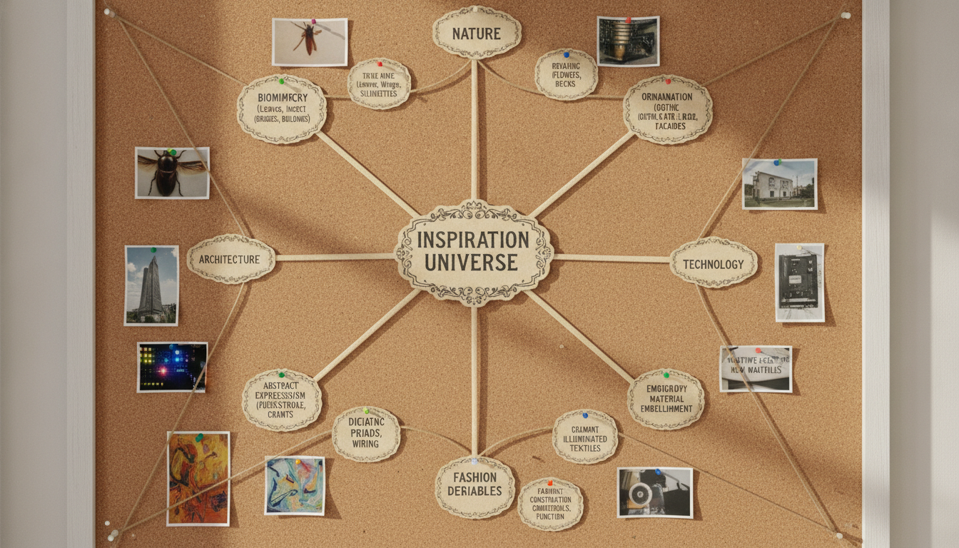
Build an inspiration map from outside fashion

Next, step outside fashion on purpose so your references push you somewhere new instead of back into the same trends. Try pulling 5 to 10 sources from architecture, film stills, nature, vintage objects, and personal memories, then pin only what you can describe in one sentence.

For example: a concrete stairwell with sharp shadows, a rain-soaked movie frame, a beetle wing, a worn leather camera case, and your grandfather’s work jacket. The constraint helps: if you are short on time, skip scrolling and choose one source from each category in 15 minutes.

Also, translate every source into design variables you can actually design with. Common mistake: collecting beautiful images but never deciding what they change in the garment, so the board stays decorative.

Use this quick mapping checklist:

  • Silhouette: column, cocoon, wedge, hourglass

  • Proportion: dropped shoulder, elongated torso, high waist, cropped hem

  • Surface: matte vs sheen, ribbed texture, slub, patina, abrasion

  • Color: two-color story, low contrast neutrals, one sharp accent

  • Movement: stiff and sculptural, fluid and trailing, swing, bounce

In practice, write one line per source that connects it to at least two variables. Example: “Stairwell shadows → angular shoulder line + high-contrast charcoal to cement” or “Beetle wing → iridescent surface + tight-to-loose proportion shift.” When you do one thing, make it this: force a variable choice for every reference, even if you later revise it.

Transform references into original design decisions

Next, treat your references like raw material, not a template. If you can point to one photo and say “it’s basically this,” you are still in copy territory, even if you swapped the color.

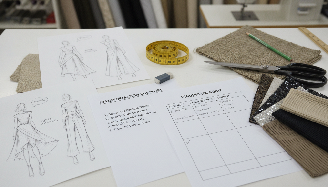
A fast way out is a transformation checklist that forces changes in the parts that matter most in fashion design. Prioritize silhouette and construction first, because they read from across the room and in photos; prints and colors come after.

Use this checklist on every key reference (10 minutes per reference is usually enough):

  • Silhouette: change proportion or balance (e.g., cropped boxy jacket becomes long and narrow)

  • Construction: change seams, panels, closures, or layering (e.g., princess seams become a yoke plus pleats)

  • Materials: change weight, hand-feel, or rigidity (e.g., denim becomes boiled wool or coated cotton)

  • Context: change the wearer, setting, or purpose (e.g., “night out” becomes “bike commute in rain”)

  • Detail drain: remove one signature detail you are tempted to keep (e.g., the same pocket shape)

Also run a similarity audit before you commit to a final sketch. Put your sketch next to the reference and compare the details an IP or brand team would notice first.

If you do one thing, audit these “high-risk” elements:

  • Outline at a glance: hem length, sleeve volume, neckline shape

  • Signature placements: pocket position, hardware location, logo-like motifs

  • Unique construction cues: unusual seam maps, distinctive cutouts, recognizable quilting

  • Surface cues: one-of-a-kind print layouts, repeated icons, specific color blocking

Here’s the catch: the audit only works if you actually redesign what is too close. A common mistake is changing three small trims and keeping the same silhouette plus seam map; the fix is to force one major change (silhouette or construction) and one supporting change (materials or context) before you move into sampling.

Closing remarks

So the quote “Good artists copy, great artists steal” only helps if you redefine “steal” as transform: take an input, change its purpose, and make clear choices that only make sense inside your point of view. If you do one thing, make the transformation visible in your process, for example, a three-step note that shows reference → change → design decision.

That said, try this quick test on your next concept: remove every brand name, logo, and signature detail from your references and keep only the feeling. Write 5 to 7 adjectives (for example: tight, quiet, sun-faded, ceremonial, heavy, playful), then sketch one silhouette and pick two materials that match those words.

Here’s the catch: if your result still looks like a specific label, your inputs are too close, not your skills. Fix it by swapping one wheel in the mix, change the era, change the function (sportswear → workwear), or change the setting (city → countryside) before you finalize a color palette and trims.