-------------------------------------

Why Colour Comes Before Sketching in Fashion Design

Learn why color-first fashion design improves sketches, fabric choices, and collection cohesion. Build your palette first—then draw with intent.
Jul 9 / Milan Fashion Campus

Key Takeaways

  • Choosing a colour direction early makes silhouettes, proportions, and details easier to design with intention

  • Colour planning reduces redesign time by preventing mismatches between concept, fabric behavior, and final styling

  • A clear palette helps communicate faster with teams and keeps a collection visually cohesive

When your sketch looks right but the collection feels wrong

Also, you can have a sketch that looks perfect on its own, then watch the whole idea fall apart the moment you add colour and fabric. A coat that felt sharp in black linework can turn muddy in warm browns, or a clean two piece set can suddenly look loud once prints, trims, and shiny hardware enter the mix.

This usually happens when silhouettes are designed in a vacuum. In early drafts, it is easy to over rely on the outline and forget what the garment will look like on a person, in a shop, under lighting, and next to other pieces in the range.

Next, treat colour as a quick stress test for the whole collection, not a final styling step. In many workflows, doing palette work early can cut later revisions by around 20–30% because you spot clashes and gaps before you spend hours re drawing.

If you do one thing, do this: put your first 6–10 looks into a rough palette before refining any sketch details. It helps you catch common issues fast:

  • Too many mid tones so nothing pops on a rail

  • All the hero colours land in one outfit, leaving the rest flat

  • Fabrics fight the colour plan, like heavy tweed in a pastel story

  • Prints and solids do not balance, so the range feels chaotic

Here’s the catch: colour first works best when your collection needs cohesion across 8–20 looks, but it can feel slower if you are designing a single statement piece. If you’re short on time, skip perfect swatches and test with three buckets only: neutrals, main colours, and accent colours.

Colour sets the concept and customer before a single line is drawn

Also, colour is the fastest way to signal who the collection is for and what it feels like, before silhouette details can do any work. If your palette reads “after-work minimal” but your target wearer is “weekend street,” the concept will feel off even if every sketch is strong.

A practical starting point is a tight set: 3–6 core colours plus neutrals (usually 1–2). Think in roles, not just favourites: one hero colour that carries the story, 1–2 supporting colours, and 1 accent you can use sparingly on trims, lining, or a single statement piece.

Build a small palette that can carry the story

Next, define the mood and target wearer in plain words, then choose colours that can repeat across multiple garments without feeling forced. Works best when your colours can appear in different proportions (an all-over knit, a small print colour, a piping detail) and still feel like the same world.

If you do one thing, do this quick checklist before drawing:

  • Pick 3–6 core colours that can mix into at least 8–12 outfits

  • Add 1–2 neutrals you will rely on for volume pieces (outerwear, trousers, base layers)

  • Assign a job to each colour: hero, support, accent, neutral

  • Decide where the accent is allowed (for example: only in accessories, only in evening looks)

Common mistake: choosing too many mid-tone “pretty” colours that all compete. Fix: keep one clear hero colour, and make at least one supporting colour either much darker or much lighter so the range has shape.

Turn emotion into measurable colour decisions

But “moody,” “fresh,” or “romantic” only helps if you can translate it into choices you can repeat. Use three measurable dials to stop the palette drifting as you design.

  • Value contrast (light vs dark): low contrast reads calm and minimal, high contrast reads bold and graphic

  • Saturation range (muted vs vivid): narrow range looks refined, wide range looks playful or youthful

  • Warm vs cool balance: warm-heavy can feel friendly and energetic, cool-heavy can feel controlled and distant

If you’re short on time, skip naming a dozen emotions and set just these three dials in writing. For example: “high value contrast, mostly muted saturation, 70% cool and 30% warm accents,” then choose colours that match that brief.

Colour guides fabric choices and how the design will actually read

Next, treat colour as a fabric filter, not just a swatch decision. The same “navy” looks strict and corporate on a crisp matte wool, but softer and more casual on a brushed cotton, and it can even read almost black on a shiny satin.

If you do one thing, map every key colour to at least two material options before you commit. This catches the common mistake of picking colours in isolation, then discovering later that the fabric finish changed the whole mood.

To map colours to materials and finishes, check four things that change how the colour reads:

  • Matte vs shine: shine makes colours look deeper and can shift undertones (a cool red can start to look wine)

  • Opacity: sheer layers desaturate colour and show what’s underneath (a pastel can turn grey over a dark lining)

  • Texture: boucle, rib knits, and tweeds break colour into tiny highs and lows, so prints and colour-blocking look less “flat”

  • Drape: fluid fabrics blend edges and soften contrast; structured fabrics keep contrast crisp (especially in colour-block seams)

Tradeoff: high-shine fabrics work best when you want depth and a dressy read, but they fail when you need true-to-swatch colour consistency across a full set.

That said, a colour palette that looks perfect in a studio can fall apart in real life. Stress-test colours in at least three contexts: window daylight, warm indoor light, and phone-camera flash, because each can shift warmth and contrast.

If you’re short on time, skip building a big “mood wall” and do a fast wear-test instead: pin a 10 cm swatch onto a neutral top (white, grey, or black), step 2 meters back, and take two photos in different rooms. Fix: if a contrast pair disappears on camera, widen the value gap (make one colour clearly lighter or darker) before you redraw the design.

Use a colour-first workflow you can repeat for every project

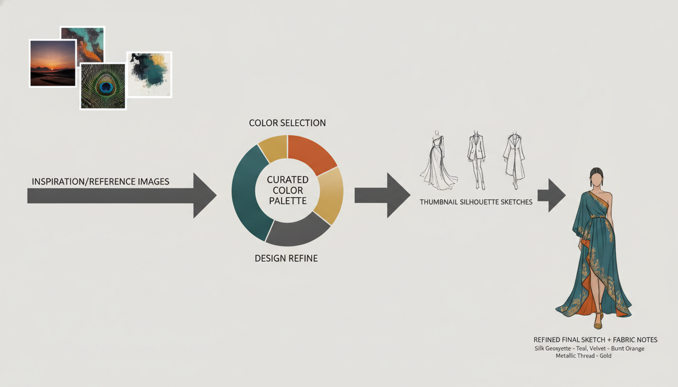
Next, stop treating colour as the final “polish” step and run the same order every time. Start with references (street, vintage, film stills, product photos), build a small palette, test it fast with thumbnails, then refine sketches and technical details once the colour story holds.

A simple project sequence you can copy:

  1. Collect references (20 to 40 minutes): pull 10 to 20 images that share a mood or customer context

  2. Build a palette (15 minutes): choose 5 to 7 colours total, with 1 to 2 neutrals

  3. Make thumbnails (20 to 30 minutes): draw 12 to 20 tiny silhouettes and block in flat colour

  4. Refine sketches + technical notes (60 to 90 minutes): only after the set feels consistent

Also, make a quick colour map for each “look” to control focal points, balance, and collection rhythm. A colour map is a small box-grid where each outfit is reduced to 3 to 5 colour blocks, so you can see repeats and gaps in seconds.

Use the colour map to check the collection before you commit time to details:

  • Focal points: if one bright accent (for example, red) appears in 6 of 10 looks, it stops feeling special, so save it for 2 to 3 looks

  • Balance: if top halves are always light and bottoms always dark, switch 2 looks to flip the weight

  • Rhythm: aim for a clear pattern (for example, bold, quiet, bold, quiet) so the lineup does not feel random

Here’s the catch: this workflow works best when you keep the palette small and commit early; it fails when you keep adding “just one more colour” to fix every sketch. If you do one thing, do the thumbnails with flat colour first, because 20 tiny tests can replace hours of re-sketching later.

Closing remarks

Design is a decision-making process, not a drawing contest.

Next time you start a collection, try making three decisions before you sketch: the mood you want (calm, sharp, romantic), the contrast level (low, medium, high), and the materials you expect to use (matte cotton, crisp taffeta, glossy satin). Those choices will quietly control what silhouettes feel “right” and which details will look busy or flat once the garment is real.

So ask yourself one practical question before your next pencil line: what would change in your next sketch if you had already chosen the mood, contrast, and materials through colour? If you do one thing, take 10 minutes to pick a small palette of 5 to 7 colours and label them by role (base, accent, highlight) so your sketching decisions have a clear direction